Thursday 23 May 2013

Open City Docs Fest digital banners

City Stories

Hybrid Forms

Science Frictions

World Visions

Moving Lives

Theatre of the Oppressor

Power Struggles

Music Docs

Shorts
Workshops & Masterclasses

Continuing on with the ripped billboard theme, I designed a series of digital banners illustrating the various strands in the festival's programme.

Thursday 9 May 2013

Open City Docs Fest 2013


For the third year running I've worked on the visual identity for 
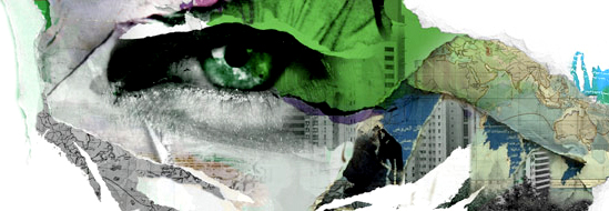
Open City Docs Fest. This year, peeling billboards were the inspiration for all of the artwork. I felt this was an appropriate visual metaphor for a number of different reasons. Firstly it suggests the act of bringing ideas into the public domain - something which documentaries often do. The billboard is a democratic form as it's accessible and visible to all. Using the image in this way suggests the idea of reclaiming public space - the space filled usually with advertisements instead can be the catalyst for more interesting conversations. Finally the peeling nature conjures ideas about revealing what is hidden - peeling away the layers. 

The festival will take place across a number of central London locations from 20 - 23 June. Lots more updates on this project to come over the next few weeks!


AOI Illustration Awards 2013 shortlist

I'm very happy to say I've been shortlisted for the AOI Illustration Awards 2013 in two categories:
Title: Interpreting, Category: Design, Client: Women's Health and Family Services

Title: Motherhoodwinked, Category: Books, Client: Orchard Wall Publishing

Black Web


Black web is another chapter (in two parts) in the Joe Grace thriller series. The story in set in the world of financial trading - specifically oil trading. The cover illustrations of the bull and the bear are rendered to resemble an oil spillage and work as a visual metaphor to represent the movement of the market.